One of the things I always strive to achieve in my photography is to find and photograph subjects that most people would never notice. Over the years, I have discovered what to me are the two secrets to doing just that.
First, always keep in mind the elements of design: line, color, texture, pattern, shape, and form.
Second, always realize that, quite often, these elements of design are going to be found in the smallest details in a scene.
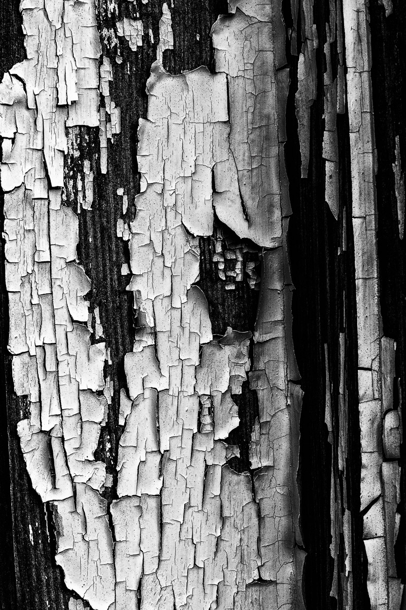
There was absolutely nothing complicated or challenging about creating this picture. It was just a shot of old, cracked, peeling paint on a window frame. It was simply a matter of remembering those two secrets and recognizing the opportunity that was, literally, right in front of me.
I had been visiting a small town just a short drive from my home. I didn’t really have any preconceived ideas of what I wanted to photograph when I arrived, so I decided to park and just walk around and see what I could find.
As I walked down one of the main streets in town, I spotted an old store front consisting of a single glass door centered between two windows. It was in a bit of disrepair and looked like it hadn’t been used in quite some time.
I approached the building and looked through the windows. It was quite obvious to me that the space had become someone’s dumpsite with boxes, papers, and other trash strewn about.
As I pulled back from the window, I noticed how the paint on the window frame had begun to crack and peel away from the underlying wood. This created a very rough textured design that I thought would make an interesting photograph.
As I set up my tripod and camera, I made sure the plane of the sensor was parallel with the strip of wood. This would help ensure complete depth of field. I wanted to capture the roughness of the paint, and had any part of the picture not been sharp, the image would have been ruined.
After increasing the contrast and clarity of the picture in Lightroom, I opened the file in Photoshop and converted it to black and white. I felt the conversion to black and white emphasized the texture and roughness of the curling paint in a way the color picture could not.
As I mentioned earlier, there was nothing complicated about this picture. It wasn’t even a challenge to create it. But, it demonstrates a simple concept. If I keep in mind those two secrets for finding photographic subjects, elements of design and attention to the details, I can create photographs that others would never see. And, for me, that is the joy of photography.
