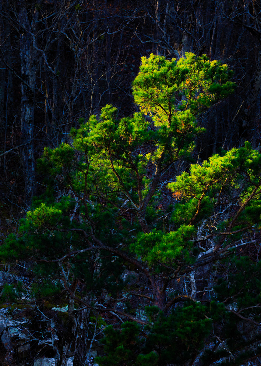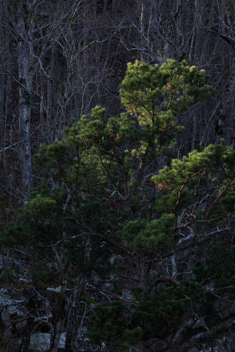
After capturing last week’s image, I began packing up my equipment to head home. Giving the scene one last glance, I happened to catch the pine tree that began to look like it was glowing. Without a moment’s hesitation, I set my tripod and camera back up to photograph it.
To me, this picture isn’t so much about the tree. Rather, it is about the lighting itself and the contrast between highlights and shadows. If the tree had been in complete shadow or in full light, I don’t think I would have even noticed it.
Composing the picture was relatively straightforward. I simply zoomed in until I got the framing I wanted, selected a moderately large aperture, and reduced the exposure by two stops to avoid overexposing the brightly lit parts of the tree. Then, it was just a matter of pressing the shutter button.
But, all of that was the easy part. I had a very clear idea of how I wanted the final photograph to look, and I spent a fair amount of time in Lightroom making adjustments to the file to create the image I envisioned in my mind.
I increased the overall exposure and contrast while also reducing the shadows of the entire picture. But, this didn’t give me the final results I was looking for.
To create the photograph I wanted, I made extensive use of the adjustment brush. I segmented the image into two sections: an area above and behind the pine tree and an area more in front, below, and including the tree.
Using the adjustment brush, I reduced the exposure in the upper section even further while increasing the exposure in the lower section. This worked to increase the contrast between the foreground, the tree, and the background. This allowed the tree to be more separated from the background and added some depth to the overall image.
These changes created a somewhat pronounced bluish cast, which I reduced by using the blue saturation slider. Using the green slider, I increased the saturation of the green foliage on the tree. Then, I reduced the texture and clarity of the image ever so slightly to give the picture a softer, more ethereal quality.
Finally, I cropped the image into a 5×7 aspect ratio to eliminate some of the unnecessary “clutter” at the top and bottom of the frame to get to the final picture.
