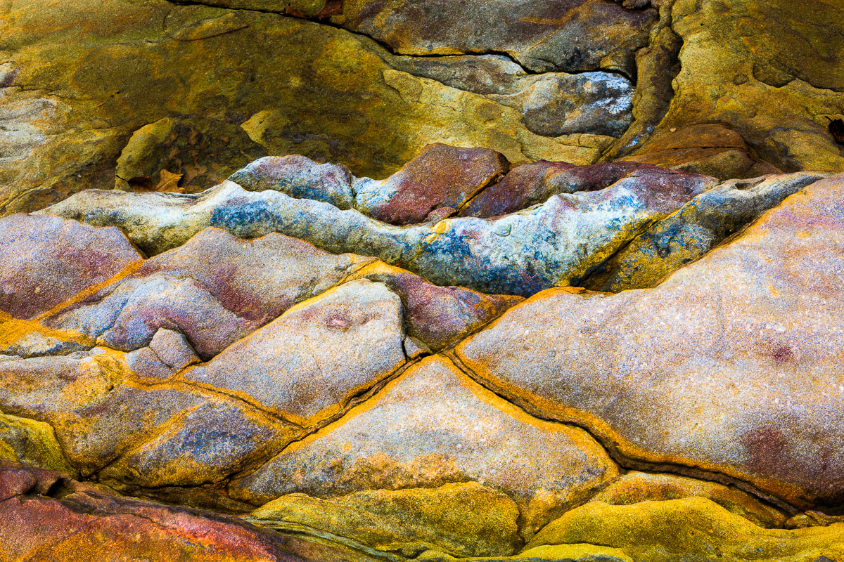
After getting the shot of the mirror-like reflection of the waterfall, I started walking around looking for something else to photograph. Ending up across the road from the waterfall, I came across these rocks.
I was immediately struck by the graphic design and how the rocks looked like they had been put together like pieces of a jigsaw puzzle. I also could make out some faint colors in the rocks that I knew I could enhance later.
The rocks were actually on three different levels, so having sufficient depth of field to ensure all three levels were sharp was critical. Fortunately, everything was on pretty parallel planes. As long as I made sure the back of my camera was parallel with the rocks and I used a small aperture, the entire frame would be in focus.
Carefully positioning my camera, I selected the smallest aperture on the lens, f/22. With the sun beginning to set, the low light level required a fairly long shutter speed of 0.6 seconds. This wasn’t a concern, though, because the camera, as it usually is, was firmly attached to a sturdy tripod.
One of the biggest challenges of photography is conveying a three-dimensional subject on a two-dimensional picture. One way to convey three-dimensionality (I’m not even sure that’s a word?) is through contrast. Contrast can be created in several ways such as enhancing the difference between lighter and darker areas or by emphasizing different colors.
Opening the file in Lightroom, the image was exactly as I knew it would be – very flat and two-dimensional. It also had a slight bluish cast to it because the light falling on the scene when I took the picture was skylight, which has a cool, blue tone, rather than sunlight, which is warmer and more yellow.
Sometimes, I like a cooler color tone. But, in this case, I wanted a tone that was warmer. So, the first adjustment I made was to increase the image’s color temperature to remove the blue color cast and provide a warmer tone to the picture.
My next concern was creating separation in the various levels of the rocks. To address this, I increased the overall contrast of the image and made adjustments to the highlights and shadow to further increase the contrast. Next, I added saturation to bring out the various colors that were embedded within the rocks.
But, I still didn’t have the separation I needed. Using the adjustment brush, I increased the exposure in the bottom three-quarters of the frame while decreasing the exposure in the upper one-quarter. This caused the brighter area to seem closer while the darker area appeared to be further away. This provided the additional separation I was looking for to create this final image.
