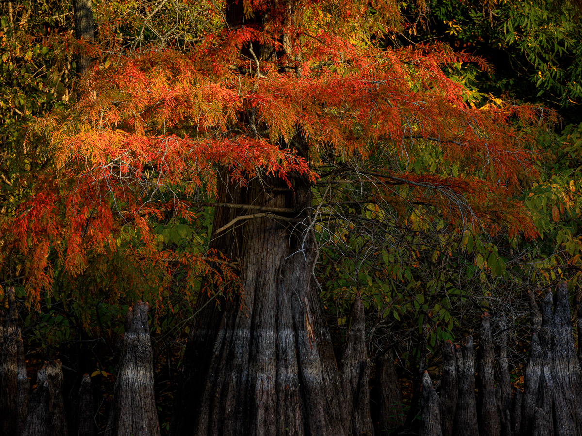
Whenever I visit Dagmar Wildlife Management Area, I’m always looking to photograph the cypress trees that line the lakes, bayous, and streams. My attempts have always been disappointing because the light was less than optimal causing the tree or trees to blend into the background. Why? Because there were no well defined highlights and shadows to provide separation. Without these two elements, images will look very flat and two dimensional. As professional photographer Rick Sammon advises, “light illuminates, shadows define.” This image demonstrates the importance of that principle and why this image of a cypress tree stands above all the other cypress tree images I have tried to capture.
When I arrived at Dagmar, I made my way to Hickson Lake. The lighting conditions were wonderful but, although I spent about an hour at that location, I just couldn’t find anything that interested me enough to photograph it. I began to very, very slowly make my way back to the main highway stopping every now and then whenever something caught my eye.
About halfway back to the main road, I passed by a small camping area where, through the breaks in the trees, something caught my attention – a cypress tree that was standing mostly in the shade, but some of its branches and leaves were being lit by sunlight.
I quickly pulled over and grabbed my gear. The tree was located on the opposite bank, so I selected my 100-400mm lens along with a 1.4x teleconverter to give me a little more reach if I needed it. With every second, the sun was rising higher in the sky, and it would be only a few short moments before the entire area was bathed in full sunlight. Working quickly, I framed this composition, pressed the shutter button, and captured this image. Less than a minute later, the sun rose above the treeline, and the amazing light was gone.
Putting Mr. Sammon’s advice into practice, I focused on enhancing the highlights and shadows to ensure proper separation between the leaves of the tree and the background foliage. To do this , I worked primarily with the luminance and saturation sliders in Lightroom’s HSL panel. Because I wanted the focus to be on the red and orange leaves, I increased the brightness and saturation of the red and orange tones while reducing the luminance and saturation of the green and yellow tones. I also made a small reduction in overall exposure and a very slight increase in contrast. Finally, I added a small vignette to darken the corners of the frame to further separate the red and orange leaves from the background.