Bing Crosby once sang “It’s Beginning to Look a Lot Like Christmas.” Well, it’s not looking much like Christmas here yet. But, with temperatures dropping into the 20s and low 30s at night, it’s certainly beginning to feel a lot like Christmas. But, even though Christmas is only 18 days away, Autumn is still hanging in there, and there are still a few patches of color to be found.
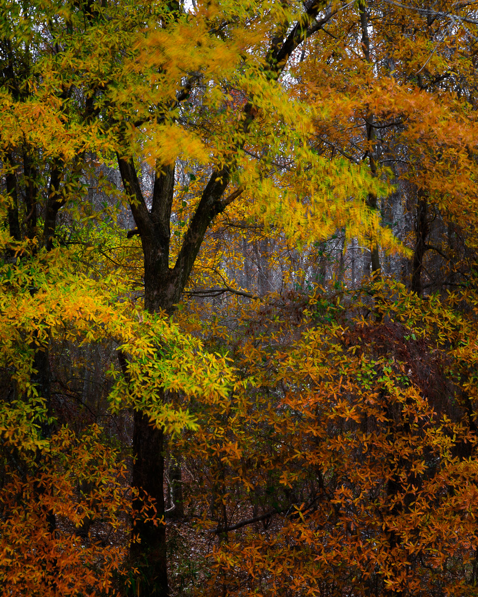
I drive by this scene nearly every day on my way home for work. I hadn’t really noticed it before because it just blended in with everything else. But, as I drove by it a few days ago, a lot of the leaves on the surrounding trees had dropped, which made this one section jump out. So, a few days later, I got up early and made the 20 minute drive to the area.
Finding a spot to get off the road and park my truck, I grabbed my camera gear and walked back to the scene. Although there was practically no traffic, the shoulder of the road was pretty narrow, so I didn’t feel comfortable setting up my camera that close to the road. Making my way down the embankment, I found a spot that was relatively flat and got set up.
When I first left the house, the sky was overcast, and the wind was calm. When I arrived on location, the sky was still overcast, but an intermittent wind had started to blow. Given the low light level, the f/10 aperture, and the 13 second shutter speed, the wind was going to pose a challenge when it came to keeping everything tack sharp. Raising the ISO would have allowed for a faster shutter speed but it created its own problem in the form of undesired digital noise. After pondering my options for a few minutes, I decided to go with my original settings and let the leaves blur if that’s what happened.
The overcast sky produced very even lighting, which eliminated any harsh contrast. But, that also meant the image looked very flat and two dimensional. By adjusting the exposure and contrast sliders and the tone curve, I added a sense of depth to the photograph. Making adjustments with the calibration sliders, as well as the luminance and saturation sliders in the HSL tab, I enhanced the colors in the scene without oversaturating them and making them look gaudy. Using a couple of radial gradient and color range masks further enhanced the contrast as well as lightened and darkened various areas of the image to help move the eye around the picture. Finally, I cropped the image to a 5:4 aspect ratio.