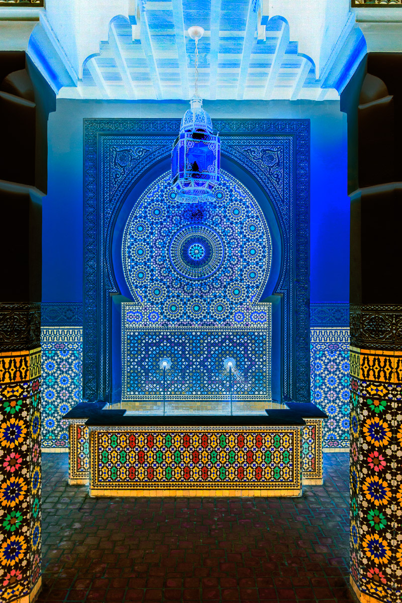
A couple of weeks ago, I shared a picture in which I had used Photoshop to invert the colors in the photograph. The resulting image was quite an unexpected surprise, and I loved the effect. (You can read that post here.)
I began to wonder what other pictures in my photo library would look like if I applied the same technique. So, I began experimenting with the inversion process on other images.
Most of the results were not what I hoped they would be. It seemed that the colors in most of the photographs were too close in tone to create the look I was wanting to create.
But, then I came across a photograph I took several years ago of a colorful foyer that led to the entrance of a restaurant in the Morocco pavilion in Epcot’s World Showcase. I always liked the colors, design, and symmetry of both the fountain and the foyer.
But, when I inverted the colors of the picture, the result was this incredibly colorful, almost psychedelic, image. The colored tiles on the foreground columns and midground fountain became almost fluorescent, and the back wall and ceiling took on cool bluish tones. The whole scene makes me feel like I am about to enter a ride through a fantasy world.
Here is a side-by-side view with the original image on the left and the inverted image on the right:

