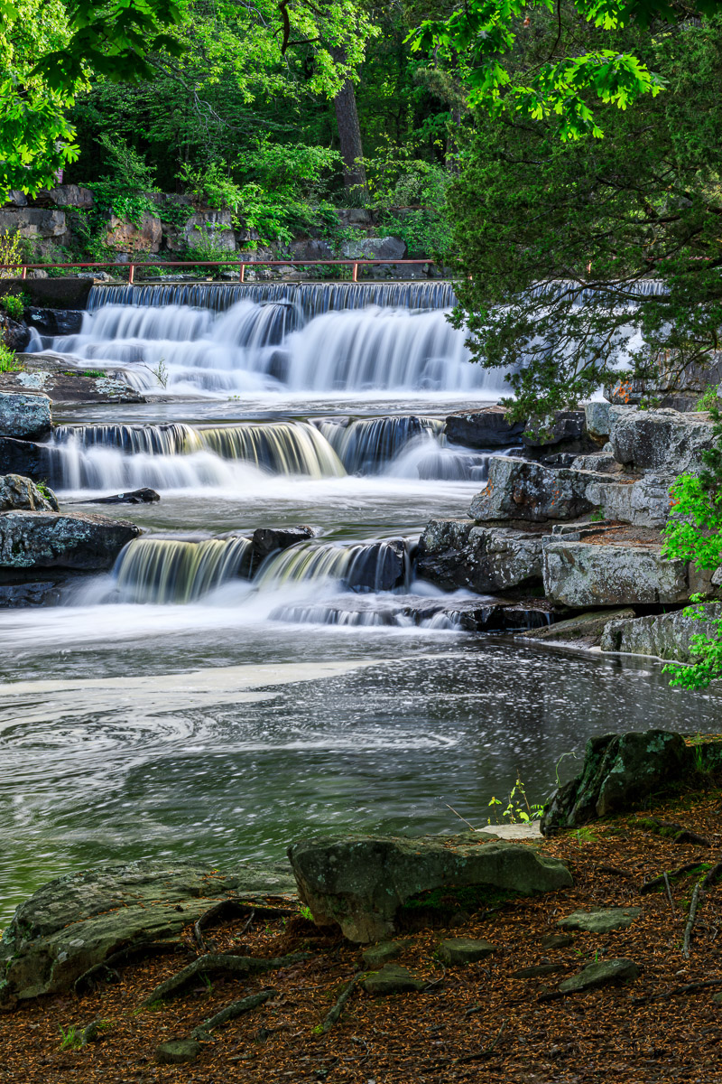
After discovering Petit Jean State Park’s Lake Bailey waterfall five or six years ago, I have returned several times to photograph it. Depending on how much rain we’ve gotten, the flow of water can be impressive, or it can be nothing more than a small trickle. But, both situations can provide some interesting photo opportunities.
I recently revisited the dam after a period of rain, so the water was really flowing. Reaching the waterfall, I noticed the water was swirling and creating some very interesting abstract patterns downstream from the waterfall. I set up my camera and began photographing these patterns. Later, when I viewed them on my computer, I found that my depth of field was too shallow, and the images weren’t completely sharp. While I was disappointed, I realized that would give me an “excuse” to revisit soon and try again.
After a few minutes, I turned my attention back to the waterfall. I went to a few different spots and got some photos, but they all felt very similar to images I had made on previous trips. I packed up my equipment and started toward another location when I happened to look behind me and saw this scene. I immediately recognized that this was a perspective I hadn’t captured before.
What I liked was the way the foreground creekbank and the overhead branches formed a natural frame around the waterfall. Because the sun was still relatively low in the sky, only the higher leaves were catching any light leaving the creekbank itself in shadow. The lighting situation, while photographically challenging, provided a second element that really caught my attention: a sense of quiet peacefulness and tranquility.
Composing the image was relatively straightforward. My 100-400mm lens, which I had been using most of the morning, was still attached to the camera and provided the perfect focal length, 135mm, I needed. This focal length kept everything in proportion so no one particular element or area of the image from overpowering everything else. Everything had a nice, pleasing balance to it.
In Lightroom, I tried several different cropping ratios (4:3, 5:7, etc.), but they all seemed to unbalance the image to me. The best crop ratio turned out to be no crop at all.
I made some adjustments to the overall exposure, contrast, and highlights. I also opened up the shadows in the foreground, but I was careful not to open them up too much because I didn’t want to lose the feeling of it being early morning.
I spent a fair amount of time making color adjustments using the Hue, Saturation, and Luminance sliders. Using these sliders I was able to add some contrast to the greens, yellows, and oranges in the image. These adjustments helped provide a sense of depth to the scene, as well as, balanced the colors in the image, which were heavily influenced by the blue morning sky.
