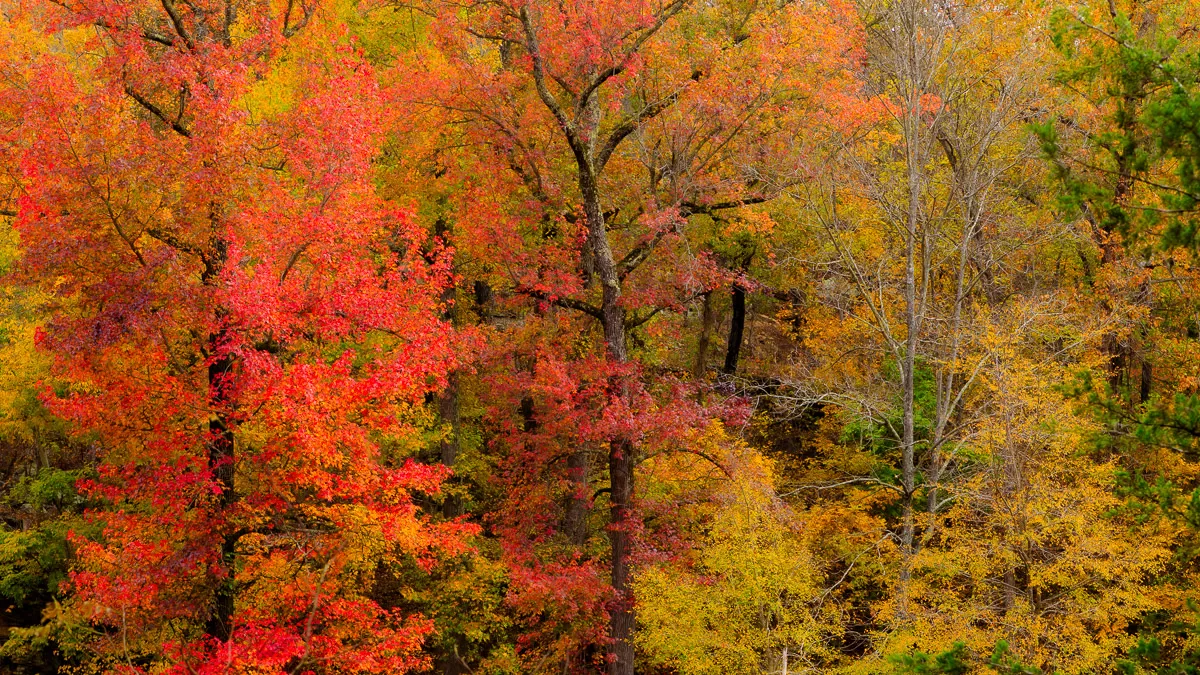
Can you feel it? It’s right around the corner. It’s literally just two or three days away. What is it? Why, it’s Autumn, of course! That time of year when the brutal heat of summer begins to fade away, but the bone-chilling cold of winter has not yet set in. That time of year when Mother Nature (hopefully!) puts on her best fashion show and turns the world on fire in the red, yellow, and orange colors of the season. Oh, Autumn, how I’ve missed you!
A few weeks ago, I was in the middle of renaming my image files and reorganizing my image library. I know, I know, I shouldn’t be doing that. I should develop a system and stick to it. The problem is I haven’t ever really found a system that seems to work for me, although I hope, and I think, this one will.
Anyway, as I was in the middle of this process, I found an image I had made on a trip to Devil’s Den State Park back in late 2021. I remember how, at the time, I had kind of dismissed the picture as boring and uninspiring with several distracting elements that I didn’t like, so I left it to languish on my hard drive never to see the light of day again.
But, when I came across it a couple of weeks ago, it caught my attention. It had all the colors – reds, oranges, yellows, greens – that scream Autumn. And, in my mind’s eye, I pictured the type of scene the late Bob Ross might have painted. Let me say, had I found this image sooner, it would probably have made it as one of my favorite images of 2021.
Opening the image in Lightroom, the first thing I did was crop the file to a 16:9 aspect ratio to eliminate the elements I had originally found so distracting, including a road at the bottom of the frame and patches of overexposed sky at the top. Next, I used the Calibration sliders to enhance the colors. I then set my white and black points and then adjusted the tone curve to enhance the scene’s contrast. I reduced the overall exposure of the image ever so slightly to help bring out the colors a little bit more. Then, I reduced the texture and clarity in the scene to give it a softer and, what I hope to be, a more painterly quality to it. Finally, I used the Vibrance slider to give a slight boost to the less saturated yellows and greens.
Once all those adjustments were made, I opened the file in Photoshop, where I used Topaz Lab’s Sharpen AI filter to apply some slight sharpening to the image before saving the final photograph to my image library.