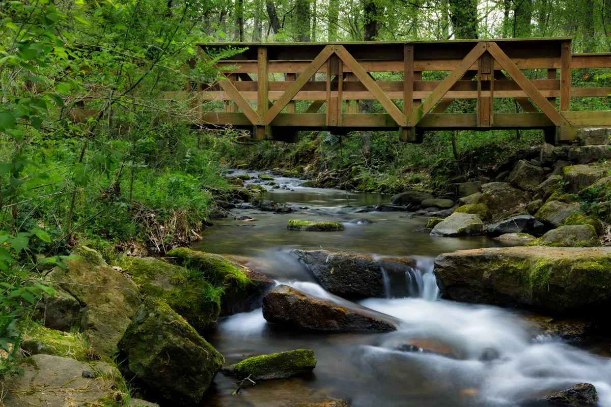
A few weeks ago, I was fortunate enough to have some time to get out a bit to do some photography. Oftentimes, getting out to do photography is my opportunity to decompress, to not have to focus on anything other than making pictures. Unfortunately, this opportunity to get out just so happened to be the weekend before the total solar eclipse, so most of the places I had thought about going were full of people who came into the state to witness the event. This, of course, was going to make it difficult to get away from it all so to speak.
I finally decided to make the one hour drive to Collins Creek in Heber Springs. I have been to Collins Creek many times over the last several years, and there have only been two occasions that I can remember that there was anyone else there early in the morning. To my very pleasant surprise, history held true, and I was the only person there that morning.
Pretty much anytime I visit the creek, I invariably spend most of my time photographing the different waterfalls along the upper part of the creek. On this trip, I consciously decided to refrain from those subjects and find something else. When I arrived, I stopped at the falls for a minute or two, just to have a look, before continuing along the trail that parallels the stream.
Eventually, I came across this bridge crossing the creek and immediately liked the scene of the creek flowing underneath creating some small waterfalls with the trees in the background. Everything felt so calm and peaceful, and it was. Stepping onto a small rock ledge, I set up my camera and framed up this composition.

I realized that I could not obtain the depth of field I wanted in a single image, so I took four pictures with four different focal points: the rocks closest to the camera, the area of the small waterfalls, the rock in the middle of the creek under the bridge, and the background trees.
When I process my images, I tend to make mostly global adjustments to exposure, contrast, and so on; occasionally, I will use the brush tool in Lightroom to make a localized adjustment or two, and that’s about it. I tried to do the same thing with this photograph as well, but it didn’t take long before I realized that I needed to do something different. That “something different” was to use seven different masks to create exactly what I wanted.
I used a linear gradient along the top edge of the frame to darken the sky. The brush tool was used to darken the plants on the left side of the frame. A second brush tool was used to reduce the brightness of the rocks. I used a third brush tool to brighten a small patch of plants in the upper left of the frame that had become too dark. I then used a combination of a color range mask and the brush tool to brighten the bridge and separate it from the background. I used a fourth brush tool to add some brightness to the creek. Finally, a radial gradient was applied to the waterfall on the right to lower its brightness and reduce the blue tones in the water.
Once I had completed processing the first image, I synced the adjustments to the other three images, so all the images would have the same processing. I then opened all four processed images in Photoshop as layers and used the “Auto Blend Layers” command to combine all four files into a single image with complete depth of field and sharpened the image using Topaz Labs’ Sharpen AI. Finally, there was a large white mass of what appeared to be feathers in one of the plants, so I used Photoshop’s Generative Fill to remove it, which worked surprisingly well, I thought.
While I like the end result, there is one thing that continues to bother me just a little bit about this image – the bridge is too close to the top of the frame making it feel cramped and giving a sense that someone walking across it better crouch pretty low. I wish I had noticed that when I composed the picture on location, but I was too concerned with trying to eliminate as much of the sky as possible to avoid blown out highlights that, looking back at it now, weren’t really as big of a concern as I thought they would be.
To address this, I have been toying around with Photoshop’s Generative Expand feature to add some room at the top of the image. While some of the results have been promising, they haven’t been good enough to use. But, I’m going to continue working on it until I figure it out.