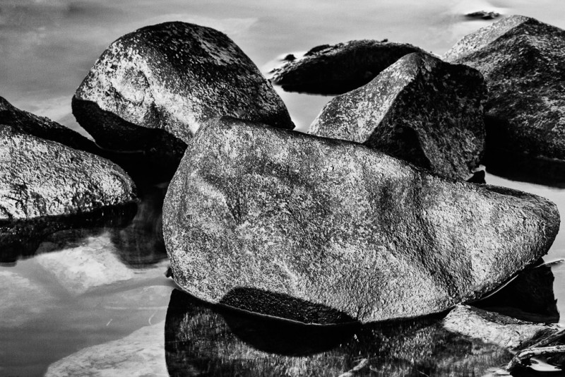
I am constantly working to hone my skills and strengthen the artistry of my pictures, whether it is by reading articles and blog posts, listening to podcasts, or viewing photographs on websites like Flickr or 500px, However, I have found that none of these methods seems to work very well on its own. They each need one component that only I can provide, and that is to study the images in my own portfolio to see not only the areas I feel I need to improve upon but also the things I believe I did well when I took a particular image. Looking at a couple of hundred images at once allows me to identify trends that I may not notice when I am looking at only a few pictures at a time from any particular shoot. For me, this simple step of looking at my own photographs, without trying to compare them to anyone else’s, can be quite enlightening.
I recently did this review, and I discovered something quite interesting. I found, looking at over two hundred of my pictures, that at least 95 percent of them were color photographs. I know most of my images are in color because that is how I inherently see things. But, there are many black and white photographs that I have seen and admired, so why do I have so few of them myself?
As I thought about this, I began thinking about the design elements of a photograph and the nature of black and white photography. There are basically six photographic design elements: color, shape, form, texture, line, and pattern. In color photographs, the predominant element is usually color, which makes perfect sense since the photograph is a color photograph. But with black and white photography, color is eliminated as a design element. Instead it is replaced by tones, or shades, of gray. Again, that makes perfect sense since it is a black and white photograph. With the absence of color, incorporating the remaining design elements (line, pattern, form, shape, and texture) is critical in composing a striking black and white image. This same philosophy must be carried over into color photography to create stunning color images. Strong, bold colors cannot be a crutch that supports an otherwise ordinary picture.
As I continued studying my photographs, I found that quite often the only design element I could definitively point out was the element of color. Very seldom could I easily identify any of the other five design elements in my images. So, the conclusion I drew from this is that the reason so many of my images are in color is because they generally cannot stand on their own without the color component. I am forced to admit to myself that color is my photographic crutch.
So how can I incorporate this newly discovered knowledge into my own photography? By teaching myself to see things from the standpoint of interesting lines and patterns or compelling forms, textures, and shapes. While color will always be an important aspect of my photography, I must learn to bring the other design elements to the forefront and let color complement, rather than dominate, my images. In other words, I must learn to first see pictures from a black and white standpoint. By making this one change in my approach, I hope to achieve the artistic quality I am looking for in my photography.
Settings: Canon 5D Mk II, 400mm, 1/6 sec, f/32
This is a nice, educational post. I think I will share it with my daughter to enrich her homeschool studies.
I hope it will be helpful and maybe even enlightening!